Saving Design, 1 Christmas Party at a Time.
As we begin to approach the final quarter of the year, I thought I would share my thoughts on the Generic Christmas party invitation.
Generic Christmas party invitations in the Australian workplace usually comprise of fake trees, baubles, pretend stars, snow flakes (even though we celebrate Christmas in Summer) and NSFW Photoshop skills conjuring up custom imagery of employee faces onto Santa's reindeers. Leaving Santa's face as prime real-estate for the CEO's handsome mug.
Australia needs to be taught that this sort of behavior in our beautiful, design heavy environment cannot continue. As designers, it is our purpose, priority and call of duty to educate the world that design matters - no matter the product! Our work should be gently underpinned with a polite, "Hey, hey everybody, we would just like to remind you that good design strengthens brands, indeed matters and should matter to you!".
Christmas party invitations are no exception. They can be utilised as an efficient piece of marketing collateral. For example: serving as the style guide/art direction and 'drip-feed' for December's social media content. Driving your companies online presence home through to end the year with a solid month of promotional material.
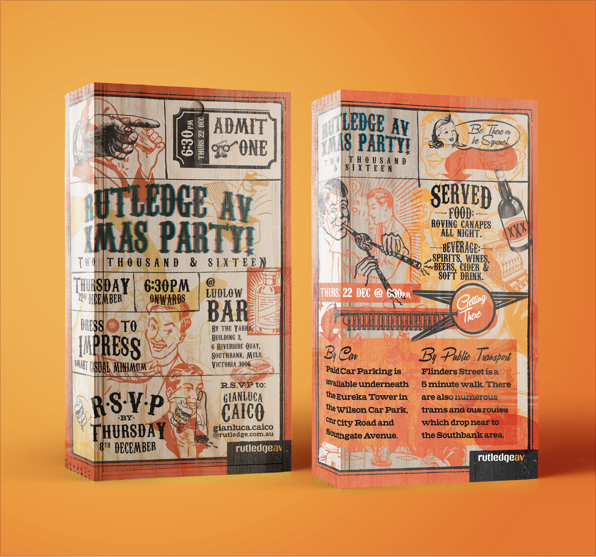
I was awarded creation of our annual Rutledge AV (RAV) 2016 Christmas party invitation. The beauty is that I was given free reign-deer (see what I did there) to take the design and art direction into a space where generic Christmas party invitations had only dreamt of going - the weird and wonderful land of vintage styled screen print aesthetics.
Form must follow function. This style begs for 1950s advertising elements to be used as subject matter that knocks at the door of nostalgia lane hosting our companies Baby Boomers. On the other end of the spectrum, the vintage style would still equally hit home with Gen X & Y employees through the use of funky overlaid graphics and the rich, vivid Rutledge AV colour palette.
The challenge was keeping vital party information (date, time, location, directions etc.) legible when combined with the vintage imagery. The solution was to fundamentally adhere to a structural grid. Ensuring imagery had breathing room and complemented the vital information enough so as the text was 100% legible for employees of all ages.
As I reflect on this project I can see that much of my attitude toward the Christmas Invite comes from my time working at Kwik Kopy, being directed by corporates to design their promotional material. The customer was always right, apparently. DISCLAIMER: I claim no responsibility for the corporate driven, vexatious design put forth into our world. The system must change.
See full project here: https://www.behance.net/gallery/46275563/Saving-Design-1-Christmas-Party-at-a-time

